Banana Republic:
Website has a big section of the page that keeps changing from a picture of a woman to a picture of men. Flashing interferes with my page scanning. Having a static image containing a men and a women could accomplish the same goal without flashing.
The site has links to Gap, Old Navy... The size selection is not preserved between the sites; it adds extra work that could be avoided. Time spent looking for tops is spent on changing the size.
Gap:
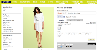
White categories text on lime background is just not very readable. Yes, it looks spring like but more contrast is needed here.
Clicking a little quick preview button shown on hover of the image opens a layer dialog with additional information about the product. Nice, my location on the inventory page is preserved without clicking back and scrolling. On the other hand, my expectation as a user that clicking preview button is the same as clicking on the image. Quick preview button is also not always visible; I have to hover on the image, and then scroll to the bottom left; that is extra work. Could a permanently displayed button do the same job? I think it can.
"See all" is selected by default when a category is selected. That what I always click when I am trying to buy something so I like it. Product pictures have a good size and give me a good idea what the product is quickly.
There is "Based on X ratings..." information at the top of the screen. I want to read reviews, but wait.. it's not clickable. I have to search for another control. Here it is in small font "See all reviews". Oh now I also see that there are reviews visible on the product page itself. I didn't notice it because it is below the fold. Making "Based on X ratings" clickable would be beneficial.
When you click on the image to see full product page and then click you are taken to exact place where you left of without scrolling. A lot of sites don't do this and make you scroll which is too bad since users could be viewing more products.
Immediate zoom on the product page is great! No button clicking, I can see details right away.
JCrew
Please add a quick preview :)
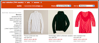
Clicking on a product, clicking back is too much work for me. And the place on the inventory page is not preserved; I have to scroll and search where I left off.
Having "Sale" in the top category is handy... If I want to see sales items I will still search for it even if you hide so giving it to me right away is good.
Right alignment of the subcategories make is harder to scan. I am not quite sure why right alignment has been chosen here. To line up number of items in each category? That is not that important to me as uses; I don't decided "click/not click" based on the number. Finding the category quickly is more important to me.
There is no "See All". Sigh.
To zoom into a product image there are too many clicks: click on an image and a dialog with a bit bigger image comes up (it is bigger but is not significantly bigger to be able to see the details), click zoom in and then move image around. Gap's zoom solution is better. Unlike Gap, JCrew has multiple pictures of the product on a model from different sides hovering on the image changes the preview image. Nice.
There are no reviews. Reviews seems to be expected nowadays.
:) I better stop usability exploration or I'll buy a cute trench coat!


